Data-Visualization-Portfolio
Part I: Final Project
Topic: 🏃♀️ Staying Healthy in the Age of Screens
Outline
High-level Summary ✍️
Even though technology has simplified our lives and has become increasingly embedded into every aspect of our daily routines, spending too much time in front of screens can be detrimental to our physical and mental health.
Reader’s objective 📖
As a reader, I want to understand how I can minimize screen time so that I can focus on improving my health in the long run. I can do this by turning off my phone notifications and setting time limits for social media applications.
Project Structure 🪜
- Setup: It’s now much simpler to connect with people worldwide and exchange information and resources because of the immense power of the internet.
- Conflict: However, excessive screen time exacerbates mental and physical health and sometimes hurts our productivity.
- Resolution: Taking small steps such as setting time limits for social media applications to minimize screen time daily can improve one’s health in the long run.
Story Arc 📜

Sections I’d like to highlight during my presentation:
Setup
- Technology exposes us to a lot of data daily.
- People spend roughly one-half of their waking hours (44%) staring at a screen.
Conflict
- Increases chances of obesity, vision problems, and insomnia.
- Social media comparison might hurt your self-esteem.
- Reduces productivity.
- Prone to developing addictive patterns.
Resolution
- Recommendations to minimize screen time and lead a healthy lifestyle like:
- Turning off your phone’s notifications
- Set your display color scale to monochrome during work hours
- Set a time limit for apps that you use the most!
Initial Sketches 🎨
Setup
Sketch #1
- People spend roughly one-half of their waking hours (44%) staring at a screen.


Sketch #2
- Global mobile phone usage average.


Sketch #3
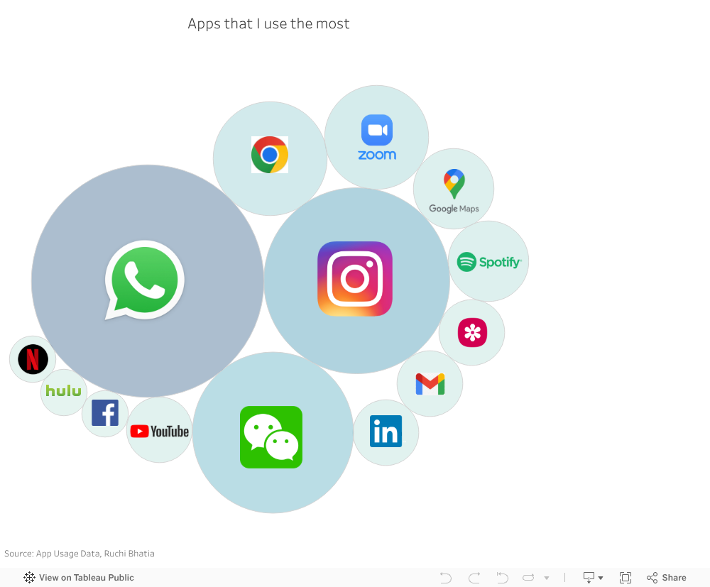
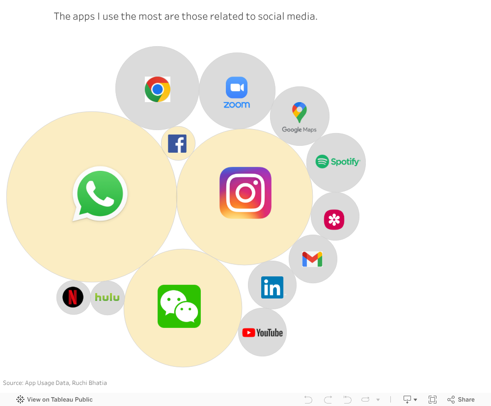
- Most people use Social media apps more than others.
- UI and UX designers spend a lot of time improving the user experience to make it more pleasant (or addictive?) since the whole business model is predicated on users remaining actively engaged for extended periods.
- The general color scheme and design of the user interface are great touches that improve the feel of using the product.

Conflict
- Reduces productivity.
Sketch #4
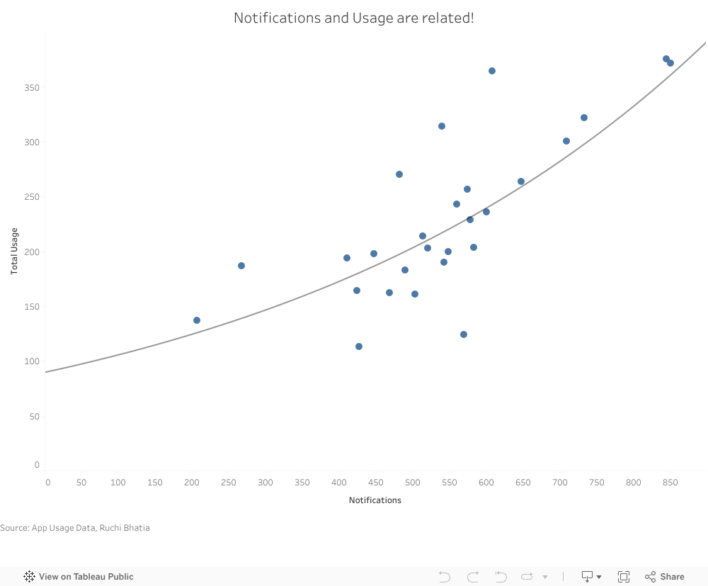
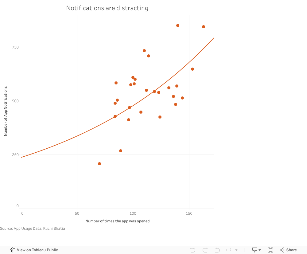
- Notifications are distracting.


- Notifications and Usage are related.

- Prone to developing addictive patterns.
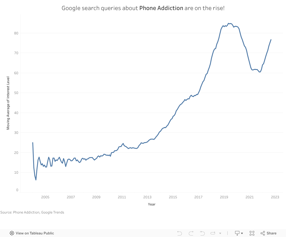
- Curiosity about the issue of phone addiction is on the rise!

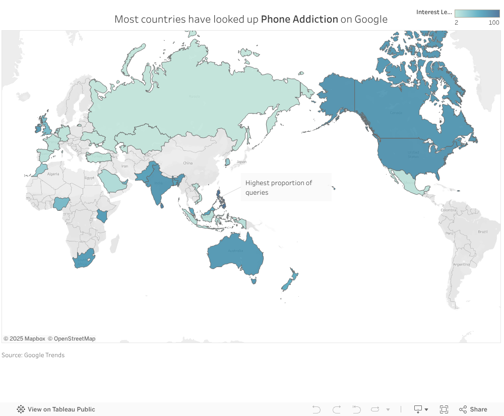
- Most countries have looked up Phone Addiction on Google!
Resolution
- Current Global average mobile usage vs Recommended


Data 📚
| Name | Description | Reference |
|---|---|---|
| Exploding Topics blog |
|
Exploding Topics (2022) Alarming Average Screen Time Statistics [online]. Available at: https://explodingtopics.com/blog/screen-time-stats [Accessed 20th September 2022] |
| Digital Wellbeing data |
|
Ruchi Bhatia (2022) Digital Wellbeing data [online]. Available at: https://github.com/ruch798/Data-Visualization-Portfolio/tree/main/data/Personal [Accessed 26th September 2022] |
| Google Trends data |
|
Google Trends (2022) Phone Addiction [online]. Available at: https://github.com/ruch798/Data-Visualization-Portfolio/tree/main/data/Google%20Trends [Accessed 26th September 2022] |
| Reid Health blog |
|
Reid Health (2022) How Much Screen Time is Too Much for Adults? [online]. Available at: https://www.reidhealth.org/blog/screen-time-for-adults#:~:text=Experts%20say%20adults%20should%20limit,spent%20participating%20in%20physical%20activity. [Accessed 26th September 2022] |
Method and Medium ⚙️
I will be using the following tools for implementing my project:
- Shorthand: for developing my story narrative and delivering it effectively
- Tableau and Flourish: for creating data visualizations that are interactive
- Canva and Venngage: for creating custom visuals that support my story arc
I intend to include accompanying graphics, such as reference charts, to help the audience understand the charts’ takeaway faster.
Finally, my call to action will include action items that will help to minimize screen time!
- Turning off your phone’s notifications
- Set your display color scale to monochrome during work hours
- Set a time limit for apps that you use the most!
In-class Peer Feedback
What worked? 😁
- Displaying charts of my own mobile phone usage data. Added a personal touch!
What didn’t work? 😟
- The dual axis Notification-Times opened chart took time to interpret.
- No visual colour grouping in the Most used apps chart.
- Colors for calendar icons in the Mobile Usage chart seemed redundant. Icons were not legible.
What questions came up? 🤔
- Are there research papers published that had a focus group of people for monitoring cell phone usage with and without notifications enabled?
- Are certain apps more addictive than others?
What new inspiration arose? ✨
It was interesting to hear that the group wanted me to look into research conducted on this topic. I plan on doing so and including more visuals in my next draft.
Final Re-Design 🖼️
Changes I made 🖌
- Changed the Notifications-Times opened chart type to make it more interpretable.
- Created a set for Social Media apps in the apps used most chart to make the social media app names stand out.
- Increased the size of the calendar icons and changed the color to black to minimize colors used in the chart.
